"Design a news feed." Twenty seconds later he was drawing components. FeedContainer, PostList, PostCard, LikeButton. The interviewer let it run for a while and then asked how many posts a user scrolls in a session, whether posts can be edited after they render, and what device the median user is on. None of those had answers, and the component tree he had spent eight minutes on turned out to be for a different product than the one being described.
Frontend system design interview questions have a framework, and most candidates lose the round in the first three minutes by not using it. Unlike backend design, the constraint is rarely throughput — it is render cost, network conditions, state ownership and what the screen does while it waits. This guide is the framework, plus worked answers for the three prompts you are most likely to get.
The framework
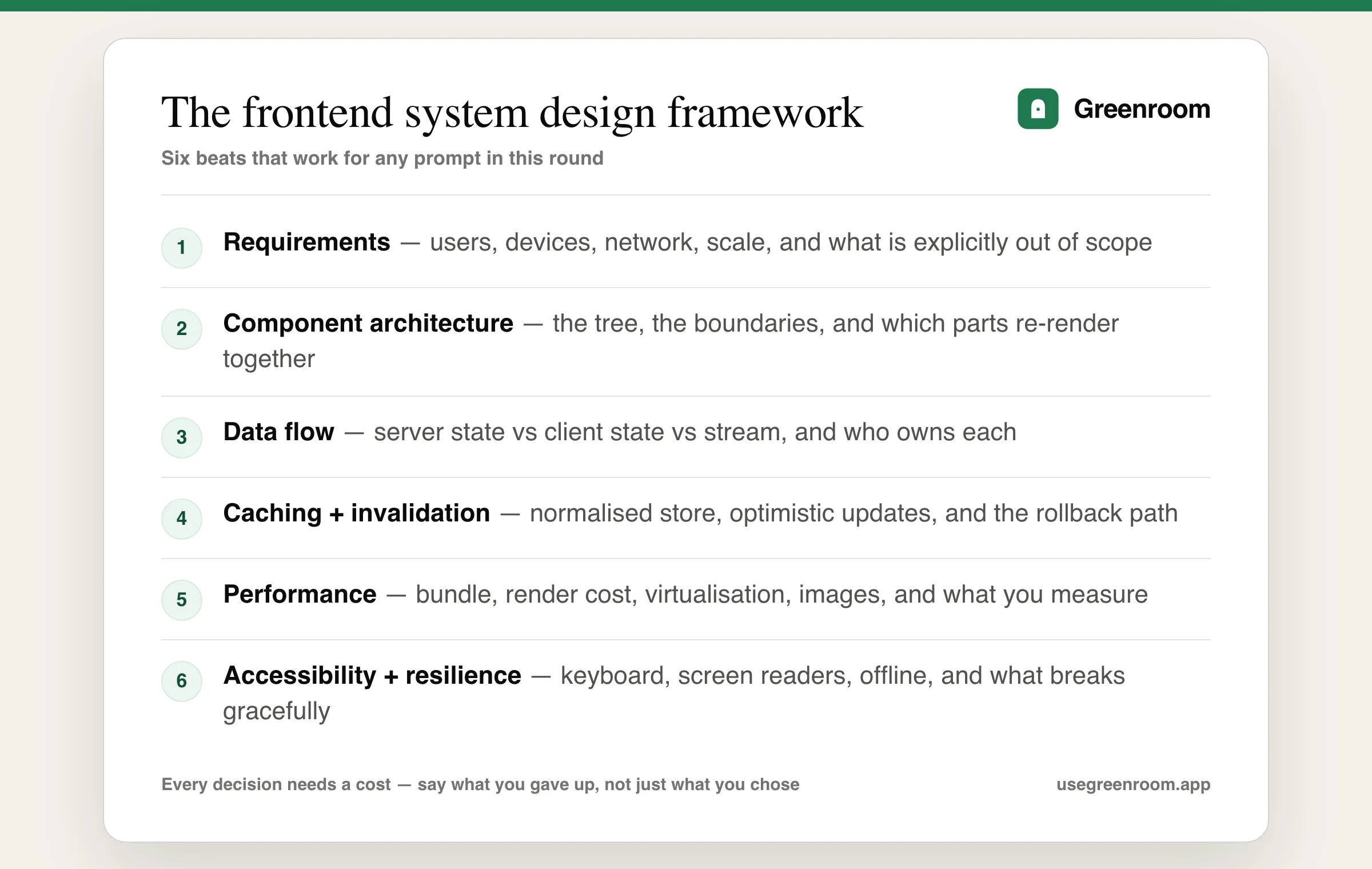
One — Requirements, two to three minutes. Who uses this, on what device, on what network, at what scale? Is it mobile web or desktop? Real-time or request-response? What is explicitly out of scope? Then state your assumptions aloud so the interviewer can correct them cheaply.
Two — Component architecture. The tree, the boundaries, and crucially which parts re-render together. Draw the boundary around anything that updates frequently so it does not drag the rest of the tree with it.
Three — Data flow. Distinguish the three kinds of state: server state (fetched, cached, can be stale), client state (UI concerns like a modal being open), and stream state (continuously arriving data). Say who owns each. Conflating them is the most common design flaw.
Four — Caching and invalidation. A normalised store keyed by entity ID so the same post in a feed, a permalink and a notification cannot disagree. Optimistic updates with an explicit rollback path. Stale-while-revalidate where freshness is negotiable.
Five — Performance. Bundle size and code splitting, render cost, virtualisation for long lists, image loading and layout stability, and what you actually measure.
Six — Accessibility and resilience. Keyboard paths, screen-reader behaviour for dynamic content, offline and error states, and what degrades rather than breaks.
Throughout: name the cost of every choice. "I'd virtualise the list — the cost is that variable heights need measurement and find-in-page stops working for off-screen items." That sentence pattern is most of what separates strong candidates.
Worked example: design a news feed
- Requirements. Infinite scroll, mixed media, likes and comments, posts can update after render, mobile-first on mid-range Android.
- Pagination. Cursor-based, not offset — say why: offsets duplicate and skip items when the list mutates between requests. Prefetch the next page before the user reaches the bottom.
- Virtualisation. Windowing so only visible items are in the DOM, with the honest costs: variable-height items need measurement or estimation, scroll restoration gets harder, and off-screen content is invisible to in-page search and some assistive tech.
- Normalised cache. Posts stored by ID once; the feed holds an ordered list of IDs. A like updates one entity and every view of it stays consistent.
- Optimistic likes. Update immediately, reconcile on response, roll back visibly on failure.
- Media. Responsive
srcset, lazy loading below the fold, explicit dimensions to prevent layout shift, and a low-quality placeholder. - New content above the viewport. Do not shift the user's scroll position — show a "new posts" pill instead. Raising this unprompted is a strong signal.
- Measurement. Real-user metrics for INP and CLS across device tiers, not a lab score.
Worked example: design an autocomplete
The most commonly asked component-level prompt, and it touches everything:
- Debounce input at around 200–300ms, and say why a shorter value wastes requests while a longer one feels laggy.
- Cancel in-flight requests with
AbortController, and handle out-of-order responses by tagging each request and discarding stale ones. This is the bug most candidates miss. - Cache per prefix, and consider a trie client-side if the dataset is small enough.
- Keyboard support in full — arrow navigation, Enter to select, Escape to close, and focus returning to the input.
- Correct semantics — a
comboboxwitharia-expanded, alistboxofoptionelements, andaria-activedescendantso a screen reader announces the highlighted item without moving focus. - Edge cases — no results, a slow network, an error, minimum query length, and highlighting the matched substring safely without injecting HTML.
- Server versus client filtering, and the threshold at which you switch.
Our frontend developer interview questions guide covers the implementation-level version.
Worked example: design a real-time dashboard
- Transport choice with a reason. WebSockets for high-frequency bidirectional data, server-sent events for one-way updates, polling when neither is justified. Say which and why rather than defaulting.
- Keep high-frequency values out of render. Write to a ref and animate outside the render cycle, or update a canvas imperatively, so a value arriving ten times a second does not reconcile the tree.
- Throttle by perceptibility. A chart may need 60fps; a summary number does not. Different data, different cadence.
- Independently loading panels. Each panel owns its own loading and error state so one slow query does not blank the page.
- Reconnection. Exponential backoff, resume from last known state, and a visible reconnecting indicator rather than a frozen number that silently lies.
- Pause when hidden. The Page Visibility API, for battery and bandwidth.
- Cleanup. Sockets closed, animation frames cancelled, observers disconnected on unmount.
Our React interview questions guide covers the render semantics this depends on.
Cross-cutting topics interviewers reach for
- Rendering strategy. Client-side, server-side, static, or streaming — and the tradeoff between time to first byte, time to interactive and infrastructure cost. Have a position for the specific product rather than a general preference.
- State management. When a library is warranted versus when context and local state suffice, and why putting everything in a global store causes re-render problems.
- Design systems and versioning. How a shared component library ships a breaking change across teams that upgrade on their own schedule.
- Micro-frontends. Know the honest costs — bundle duplication, version drift, and a worse user experience unless carefully managed — rather than presenting them as modern by default.
- Internationalisation. Right-to-left layouts, locale formatting, and strings that change length.
- Security. XSS from rendering user content, why
dangerouslySetInnerHTMLneeds sanitisation, CSRF, and where tokens should live. - Error boundaries and graceful degradation. What the user sees when one widget throws.
Our HTML and CSS interview questions guide covers the rendering fundamentals underneath.
How the round is graded
- Did you clarify before designing? (Most common failure.)
- Did you separate server, client and stream state?
- Did you volunteer the cost of your choices?
- Did you mention accessibility without being prompted?
- Did you say how you would measure it?
- Did you handle failure — offline, slow, error, empty — as a first-class case?
Where each prep option actually helps
- GreatFrontEnd's system design section — the closest thing to a canonical syllabus for this round.
- web.dev and MDN — the reference for Core Web Vitals, image loading, and the observer APIs you will cite.
- Build one of each prompt — a virtualised feed, an autocomplete, a live dashboard — and profile them. Nothing else teaches the tradeoffs as fast.
- The WAI-ARIA authoring practices — the combobox pattern alone answers half the autocomplete round.
- ChatGPT — good for generating prompts and critiquing a written design. It will not ask what device your median user is on.
- Greenroom — the spoken layer. Ari, the AI interviewer runs the design round out loud and pushes the follow-up, which is where written preparation stops working. Honest tradeoff: Ari will not profile your app, so build one.
Interviewing at a specific company? The Meta frontend engineer guide covers feed-scale prompts, the Uber frontend engineer guide covers real-time UI, and the Microsoft frontend engineer guide covers large enterprise surfaces.
Company-specific variants differ a lot: see our Apple frontend interview questions and Netflix backend interview questions guides for two very different emphases.
Frequently asked questions
How do you approach a frontend system design interview?
Use a six-beat framework. Spend two to three minutes on requirements including users, devices, network and what is out of scope; define the component architecture and which parts re-render together; separate server state, client state and stream state and say who owns each; describe caching, normalisation and optimistic updates with a rollback path; cover performance including bundle size, render cost, virtualisation and images; and finish with accessibility, offline behaviour and measurement. Name the cost of every choice rather than only the benefit.
What is the difference between frontend and backend system design interviews?
Backend rounds are about scale — throughput, sharding, consistency and failure across machines. Frontend rounds are about what the interface does while it waits and what it costs to render: state ownership, caching and invalidation on the client, render cost under continuously arriving data, network conditions, device capability, accessibility and perceived performance. The vocabulary overlaps but the binding constraint is completely different.
How do you design a news feed in a frontend interview?
Clarify the product first, then use cursor-based pagination rather than offsets because offsets duplicate and skip items when the underlying list mutates. Virtualise the list while naming the honest costs of variable heights, scroll restoration and assistive technology. Keep a normalised client cache keyed by entity ID so the same post cannot disagree with itself across views, use optimistic updates with a visible rollback, handle media with responsive sources and explicit dimensions, and never shift the user's scroll position when new content arrives above the viewport.
How do you design an autocomplete component?
Debounce input around 200 to 300 milliseconds, cancel in-flight requests with AbortController and tag requests so out-of-order responses are discarded, cache results per prefix, and support full keyboard interaction with arrow keys, Enter, Escape and correct focus return. Use combobox and listbox semantics with aria-activedescendant so screen readers announce the highlighted option without moving focus, and handle no results, slow networks, errors, minimum query length and safe substring highlighting.
What performance topics come up in frontend system design rounds?
Bundle size and code splitting, JavaScript execution and parse cost on low-end devices rather than only transfer size, list virtualisation, image loading with explicit dimensions to avoid layout shift, keeping high-frequency values out of the render cycle, throttling updates by what a user can actually perceive, and measurement with real-user metrics such as INP and CLS across device tiers rather than a lab score on a fast machine.
How important is accessibility in a frontend system design interview?
Enough that raising it unprompted is a distinct positive signal, and at some companies enough that omitting it is disqualifying. Expect to cover semantics before ARIA, keyboard paths including focus trapping and restoration, how dynamic content is announced to screen readers via live regions, and what happens for a user navigating a long virtualised list. Treating it as a functional requirement rather than a finishing touch is the framing that scores.